Chapter 2 Checking normallity
As we know, regression analysis is a statistical technique to study the relationship between variables. We have seen a basic example where we have calibrated a linear regression model to predict temperatures from some explanatory variables.
In the case of linear regression, the relationship between the dependent variable and the explanatory variables has a linear profile, so the result is the equation of a line. This type of regression implies a series of assumptions our data must fulfill. Specifically, it is necessary to comply with the following:
- Correct specification. The linear functional form is correctly specified.
- Strict exogeneity. The errors in the regression should have conditional mean
- No linear dependence. The predictors in \(X\) must all be linearly independent (low correlation).
- Spherical errors. Homoscedasticity and no autocorrelation in the residuals.
- Normality. It is sometimes additionally assumed that the errors have multivariate normal distribution conditional on the regressors.
As be have already seen, correlation analysis and scatterplots are a useful tool for ascertaining whether or not the assumption of independence of explanatory variables is met. We are noew going to find out whether our data fits the normal distribution.
2.1 About the normal distribution
A continuous random variable, \(X\), follows a normal distribution of mean \(\mu\) and standard deviation \(\delta\) (Figure 2.1), denoted by \(N(\mu, \delta)\), if the following conditions are met:
- The variable can take any value \((-\infty, +\infty)\)
- The density function is the expression in terms of the mathematical equation of the Gaussian curve:
\[pdf(x,\mu,\sigma) = \frac{1}{ \sigma \sqrt{2 \pi}} e^{\left(-\frac{{\left(\mu - x\right)}^{2}}{2\sigma^{2}}\right)}\]

Figure 2.1: Normal distribution examples.
2.2 Checking for normality in our data
There are several ways to test whether a sample data follows a normal distribution or not. There are visual methods such as a frequency histograms, boxplot or quartile-quartile charts (qqplot). There are also several tests of statistical significance that return the probability of following the normal distribution.
Normality tests:
- Shapiro-Wilk test:
shapiro.test() - Kolmogorov-Smirnov
- Anderson-Darling test:
ad.test()
These tests are available in R included in several packages:
stats(preinstalled)nortest(requires download and installation)
Let’s look at an example of a normality test using the data from regression.txt. We will create different plots to visualize the distribution of values of the variables. Then we will calculate some of the tests above mentioned.
2.2.1 Histograms
We are already familiar with this kind of plot so let’s see how to use it to find out the distribution of our elevation variable in regression.txt:
regression<-read.table('Data/regression.txt', header= TRUE, sep='\t',dec = ',')
hist(regression$elevation, breaks = 15, density = 15, freq = FALSE,
col = "darkgray", xlab = "meters", main="Elevation") 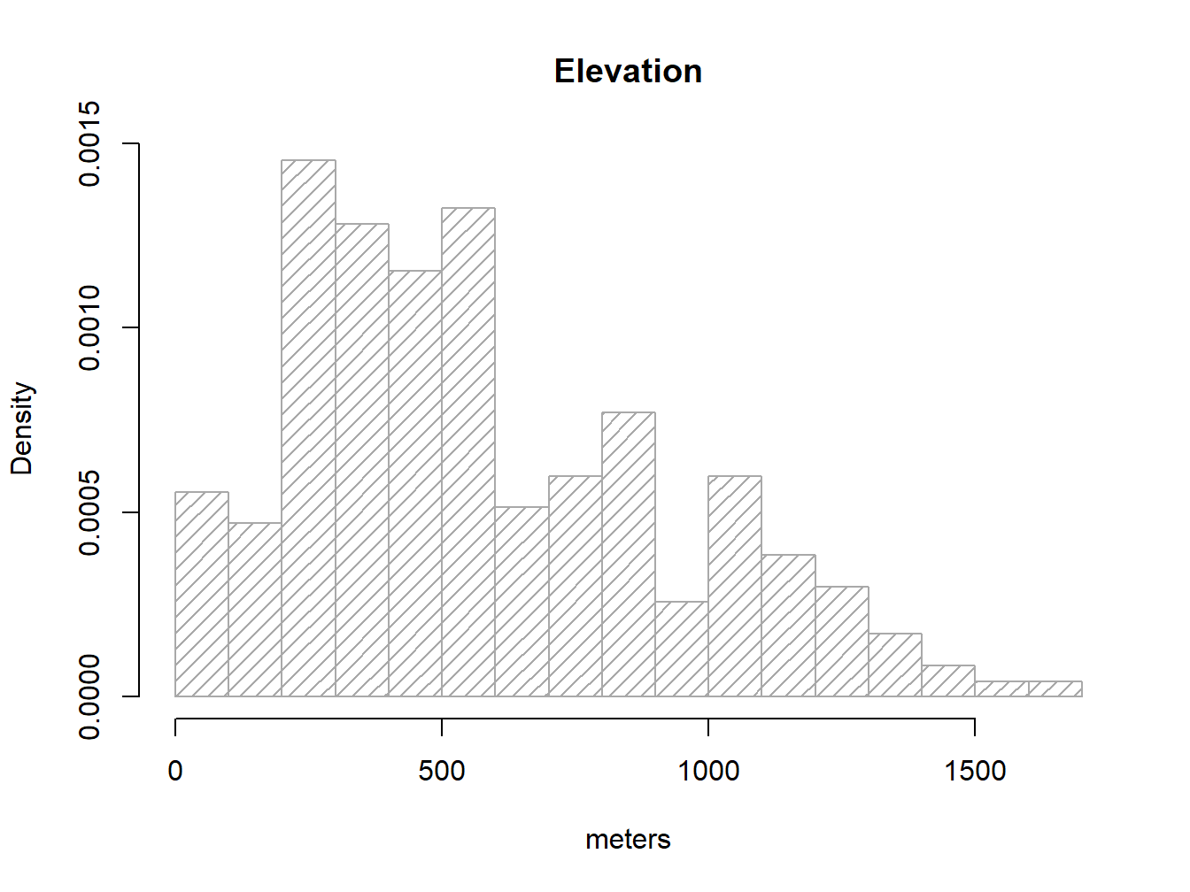
Note that I brought a couple of new arguments on hist().density=15 changes the solid filled bars with texture lines (this is just cosmetic). freq=FALSE allows expressing the y-axis in terms of probabilty rather than counts/frequency, which is needed to overlay the normal distribution line of our data. Other than that everything remains the same.
As we know, a normal distribution is charactized by a mean \(\mu\) and a standard deviation \(\delta\). Since we can obtain that information from our elevation column:
mean(regression$elevation)## [1] 575.6838sd(regression$elevation)## [1] 353.1587So, to overlay the theoretical normal distribution line of our data we create a sequence of x-values (see seq()6) and then fit the expected y-value using dnorm, a command that allows to build the normal y-values sequence.
g<-regression$elevation
h<-hist(regression$elevation, breaks = 15, density = 15, freq = FALSE,
          col = "darkgray", xlab = "meters", main="Elevation")
xfit <- seq(min(g), max(g), length = 100)
yfit <- dnorm(xfit, mean = mean(g), sd = sd(g))


lines(xfit, yfit, col = "black",lwd = 2)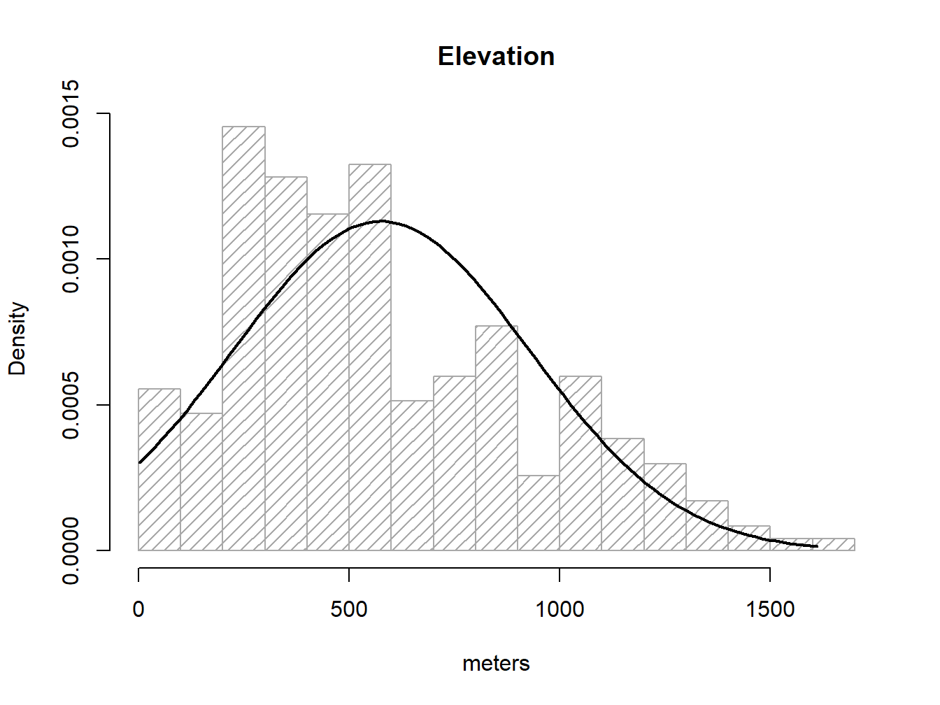
So, what we did above is:
- Save
elevationdata ing, just to avoid excesive typing. - Create our
histogramand save it to an object calledh7. - Create the a
vectorxfitfrom the minimum value ofelevationto the maximum. - Use
dnorm()to obtain the y values and save it intoyfit. - Overlay our theoretical line resuling from
xfit-yfit.
If the barplot resembles the line then we can consider our data as normal. I am aware this is not fancy at all. We’ll see some other options.
2.2.2 Boxplot
The second graphical tool that we will see to evaluate the normality of the data is the boxplot. The boxplot is a graph, based on quartiles, by which a set of data is displayed. It is composed of a rectangle, the box, and two arms, the whiskers. It provides information on the minimum and maximum values (whiskers), the quartiles Q1, Q2 or median and Q3 (box), existence of atypical values and symmetry of the distribution (outlier dots).
In R, the box diagrams are constructed using the boxplot() function. There are several possibilities for creating variations of boxplot graphics. You can find some examples here.
boxplot(regression$elevation,col='purple')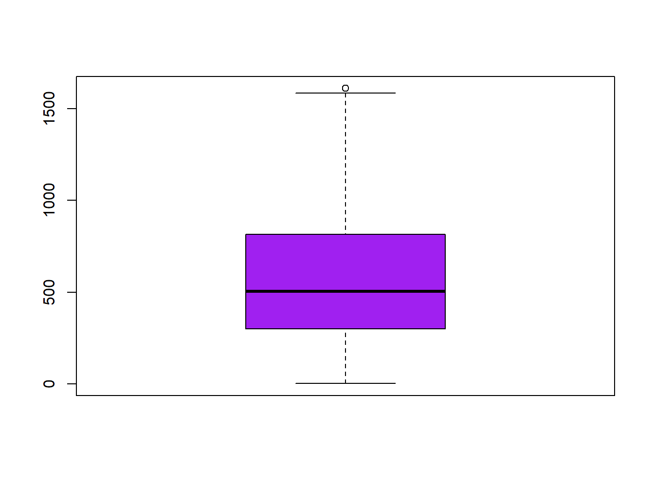
How can we infer from a boxplot that our data is normally distributed? Just check Figure 2.2, which displays a theoretical boxplot of the perfect normal distribution:
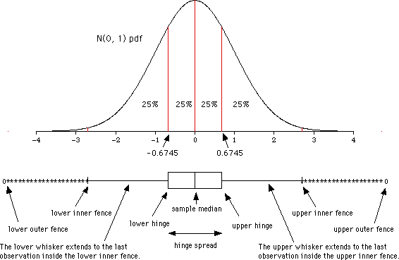
Figure 2.2: Boxplot and normal distribution. Retrieved from wikipedia.org
Boxplots are also a good way to describe our data or compare the same kind of data from different groups.
2.2.3 Q-Q plots
The Q-Q plot8, or quantile-quantile plot, is a graphical tool to help us assess if a set of data plausibly came from some theoretical distribution such as a Normal or exponential. For example, if we run a statistical analysis that assumes our dependent variable is Normally distributed, we can use a Normal Q-Q plot to check that assumption. It allows us to see at-a-glance if our assumption is plausible, and if not, how the assumption is violated and what data points contribute to the violation.
Q-Q plots take your sample data, sort it in ascending order, and then plot them versus quantiles calculated from a theoretical distribution. The number of quantiles is selected to match the size of your sample data. While Normal Q-Q Plots are the ones most often used in practice due to so many statistical methods assuming normality, Q-Q Plots can actually be created for any distribution.
In R, there are two functions to create Q-Q plots: qqnorm and qqplot.
qqnorm creates a Normal Q-Q plot. You give it a vector of data and R plots the data in sorted order versus quantiles from a standard Normal distribution.
qqnorm(regression$elevation)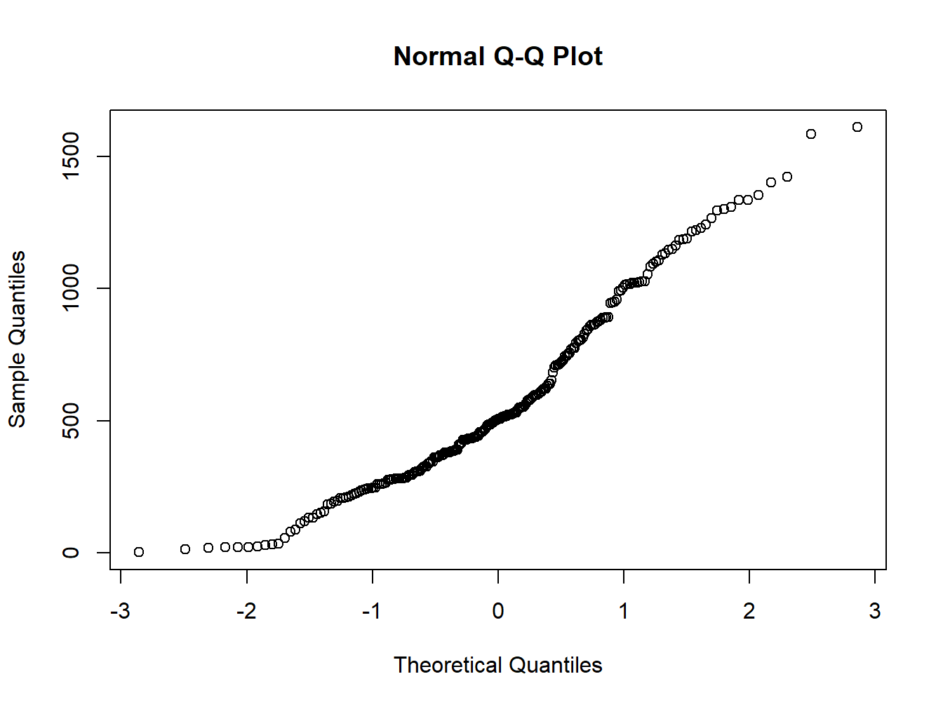
The qqplot() function allows you to create a Q-Q plot for any distribution. Unlike the qqnorm function, you have to provide two arguments: the first set of data and the second set of data.
Either way the interpretation is the same, if the points follow a straight line then the sample follows the target probability distribution.
2.2.4 Inferencial statistical tests
2.2.4.1 Shapiro-Wilk test
The Shapiro-Wilk Test is used to test the normality of a data set. The null-hypothesis (\(H_0\)) of this test is that the population is normally distributed. Thus, if the p-value is less than the chosen alpha level, then the null hypothesis is rejected and there is evidence that the data tested are not from a normally distributed population; in other words, the data are not normal. On the contrary, if the p-value is greater than the chosen alpha level, then the null hypothesis that the data came from a normally distributed population cannot be rejected (e.g., for an alpha level of 0.05, a data set with a p-value of 0.02 rejects the null hypothesis that the data come a normally distributed population). However, since the test is biased by sample size9, the test may be statistically significant from a normal distribution in any large samples. Thus a Q–Q plot is required for verification in addition to the test.
The function to perform the test in R is shapiro.test(). Be carefull, this command belongs to the nortest package. Remember to install and load it before you call the function.
shapiro.test(regression$Tavg)##
## Shapiro-Wilk normality test
##
## data: regression$Tavg
## W = 0.97931, p-value = 0.001683In the previous example the p-value obtained is 0.0016 <0.05. Therefore the null hypothesis of normality of the data is rejected and therefore we conclude that the variable T_avg is NOT NORMAL.
shapiro.test(regression$elevation)##
## Shapiro-Wilk normality test
##
## data: regression$elevation
## W = 0.95158, p-value = 4.698e-072.2.4.2 Anderson-Darling test
The Anderson-Darling Test works similarly to the Shapiro-Wilk test. We test the null hypothesis of normality of the data and reject it if the p-value <0.05.
The function to perform the test is ad.test(), implemented inside the nortest package.
library(nortest)
ad.test(regression$elevation)
##
## Anderson-Darling normality test
##
## data: regression$elevation
## A = 3.7835, p-value = 1.849e-09EXERCISE 4:
The objective of this exercise is to test the normality of the data used in Linear regression in R. Therefore, we must do the following for each variables:
- Histogram of frequencies.
- Box plot.
- Q-Q plot.
- Shapiro-Wilk test.
- Anderson-Darling test.
- Kolmogorov-Smirnov test1.
Deliverables:
- Create a script (.R file ) with the instructions used.
- Write a brief report to discuss about the normality of the variables. Include plots or any other supplementary information that supports your findings.
Consider this as homework and check what this function does on your own. It suffices to say that returns a
vector.↩Yes, we can also save plots into objects. In fact this is one of the foundations of the
ggplot2package, the most used one for plotting data, although quite difficult to comprehend at the begining.↩taken from http://data.library.virginia.edu/understanding-q-q-plots/↩
It is best suited for samples with \(N<30\)↩
Note that I use the terms calibrate, fit or adjust indistinctly.↩